Overview
Homeless Reach is a mobile app aimed to provide streamlined connections to resources, as well as emotional support, to persons experiencing homelessness. This project exists to show up with compassion and action, turning care into change for homeless people in Lansing.
ROLE
Product Designer
UX Researcher
Content & Interaction Designer
TOOLS
Figma · FigJam · Miro · Zoom · Teams
TIMELINE
Jan '24 – Apr '24 (4 months)
Collaborators
Jesse Sanderson
01 Design Challenge
People experiencing homelessness in Lansing, Michigan are not lacking services. They are lacking access to those services; Shelters fill up, phone lines go unanswered, and resource lists go stale. The people who need help the most are spending energy they don't have trying to navigate a system that was never built with them in mind.
How can we create an app to guide people through the process of homelessness?
What type of support do people experiencing homelessness need when they have searched for resources, but none are available?
What types of emotional support can an app provide to someone who is experiencing homelessness?




02 Research
Research moved from competitive analysis to interviews and synthesis to define clear UX direction. Gaps across Michigan 2-1-1, WellSky, and Samaritan highlighted the need for low friction access, clear hierarchy, emotional support, and real-time reliability. These insights translated into core features and were structured through an influencer matrix to ensure each interaction drives both motivation and action.
01 — Competitive Analysis
Three platforms were analyzed at the start of the project. The goal was to understand what already existed, where it was falling short, and whether the gap it left was large enough to be worth designing into

Michigan 211
Michigan 2-1-1 is both a phone line and a website that can help connect people in need with resources such as housing, food, basic necessities, and more.
WellSky Community
The WellSky Community Services client-focused mobile app connects to the Homeless Management Information System (HMIS), a database that tracks data related to homelessness to help measure and inform outcomes.


Samaritan City
Samaritan city is a service that aims to give people experiencing homelessness their own voice by allowing them to ask for specific things they need and track the goals they are working toward.
When planning the next steps in the development of Homeless Reach, key considerations to make based on the analysis include a low barrier to entry, effective information hierarchy, a strong emotional support aspect, and an accessible & inclusive user interface.
Barriers to Entry — Allow web downloads. Short and streamlined login process.
Emotional Support — Put power in the hands of the individual. Give them a voice.
User Interface — Selection of a soothing color scheme with a simple and accessible layout, and the Implementation of smooth and easy navigation.
02 — Interview Findings
Four case managers working across homeless support organizations in Michigan participated in structured 60-minute interviews. Each had direct, current experience supporting individuals through the service delivery system in Lansing.
Sessions followed a semi-structured format: a consistent opening set of questions anchored around the three design challenge questions, followed by open conversation to let unexpected themes surface. Responses were analyzed using thematic coding organized around two axes — barriers to access and emotional experience of the system.
Five patterns appeared across all four conversations.
Access fails at the point of entry, not availability
Shelters exist. Case managers exist. Outreach teams exist. What consistently breaks down is the first step toward any of them.
A person calls a shelter, gets no answer. Tries another, is told it is full. Tries a third. By the time they find a bed, they have burned through their phone battery, their time, and sometimes the window they had to get there safely.
Stale information is a trust problem, not an inconvenience
Multiple interviewees described the downstream effect of outdated resource data:
A person calls a number and reaches a disconnected line
They visit a food pantry that changed its hours six months ago
They show up to a shelter that closed
Case management is hard to enter from the outside
Case managers are among the most effective resources available, but reaching one typically means:
Knowing which agency to call
Navigating an automated phone system
Waiting for a callback that may not come
It became abundantly clear that the app needed a way for someone to signal that they need help and have a case manager respond directly, without the phone tree in between.
Street outreach only works in one direction
Outreach teams already go into the field to find people who cannot reach services. What does not exist is a way for individuals to initiate that contact themselves.
One interviewee described people who knew help was available but had no reliable way to communicate their location or needs to anyone who could act on it. The design implication was straightforward: shift outreach from something that happens to people to something people can request.
Plain language and multilingual support are baseline requirements
Interviewees flagged two things the app could not treat as optional:
A meaningful portion of users had not completed formal education, making complex or bureaucratic language a direct barrier to use
Lansing's homeless community includes people whose primary language is not English
An interface that assumed high reading literacy or English fluency would fail those users at the first screen. This shaped copy standards across the entire app and the decision to build language selection into the core onboarding flow.
Result: Four concrete feature requirements
Highlighted Resources needed to be specific, verified, and current. The need to surface up-to-date, reliable resource information was consistently reinforced. Information that is outdated damages trust and leaves people without the help they were counting on.
Shelter availability needed to be visible in real time. A way to check shelter capacity in real time and check in online was identified as a priority, consistent with what the competitive analysis had also surfaced.
Case Manager Connect. A feature where someone can request a case manager who will then connect with them directly to help navigate available resources.
Street Outreach S.O.S. A feature where individuals can submit a request for services and a street outreach team fulfills that request by bringing services directly to them.
03 — Influencer Matrix
Before the interviews concluded, a content strategy framework was built to make sense of what was being heard. The influencer matrix mapped every potential content type to its intended audience, the emotional response it was meant to produce, and the concrete outcome it was meant to drive. It was organized across two dimensions: motivation and ability.

The motivation dimension asked: What should this content make someone want to do?
The resource directory needed to make people feel knowledgeable and informed, with a clear outcome: learn about ways to receive direct help. Tips and Pointers needed to produce the same sense of being informed, but with the added dimension of understanding that someone learns steps they can take to help themselves, not just that help exists.
Goal Setting needed to produce a feeling of being organized and determined, with the outcome of setting personal goals to track. The Community Support Area needed to generate feelings of support, care, and community, and get people communicating with others to share tips and build support networks.
The Bulletin Board served the homeless services agencies, a completely different target audience, with a single emotional target of feeling informed, and an outcome of agencies posting bulletins to keep users up to date on availability and changes.

The ability dimension asked: What should this content make someone capable of doing?
The resource directory needed to move someone from feeling knowledgeable and prepared to actually reaching out to resource agencies to receive help.
Tips and Pointers needed to move someone from feeling motivated and determined to actively using that insight to work toward their target goals.
Goal Setting needed to take the feeling of being determined and optimistic and turn it into a behavior: tracking progress over time to stay motivated.
The Community Support Area needed to take feelings of community and optimism and convert them into action: sharing progress in achieving goals and helping motivate others.
The Bulletin Board needed to open direct lines of communication between agencies and users.
The distinction between the two dimensions was intentional. Motivation without ability produces awareness that goes nowhere. Ability without motivation produces a tool that no one opens. The matrix forced both questions to be answered for every piece of content in the app, and it made clear early on that the emotional experience of using Homeless Reach was not secondary to the functional one. They were the same problem.
03 Personas, Journey Maps, and User Flows


04 Branding
The Homeless Reach visual identity was built around the intention provide a steady, trustworthy, and human feel at every point of contact. For an app serving people navigating some of the hardest circumstances of their lives, the brand had to communicate safety and clarity before a single interaction took place.

Color Scheme
The palette is split into two groups. The dark group, anchored by Dark Blue and Teal, handles structure, navigation, and primary actions. The light group, Sky Blue, Mint Green, and Light Gray, handles backgrounds and supporting surfaces. Forest Green bridges the two, appearing in warmer and more supportive moments across the interface. Charcoal was chosen over pure black for body text to keep the reading experience from feeling harsh.
The palette deliberately avoids two common failure modes in apps designed for vulnerable populations: the sterile blue-white of institutional interfaces, and the aggressively optimistic brights of consumer wellness products.
Logo
The icon is a staircase rendered in teal, navy, and forest green. The staircase represents the core premise of the app directly: progress out of homelessness is incremental, and the app exists to make each step more navigable than the last. The upward direction was a conscious choice, grounding the identity in forward movement. The rounded container keeps it contemporary and approachable across every context it appears in.
Typography
Outfit is the sole typeface across the entire interface. It is geometric, clean at small sizes, and warm enough at display scale to avoid feeling utilitarian. The decision to use a single typeface was as much a consistency decision as an aesthetic one: one typeface, applied well across every screen, keeps the cognitive load low and the experience coherent from onboarding through to goal tracking.
05 Wireframes
Wireframing started on paper, focused on the two flows that carried the most weight before anything was opened in Figma.
Wireframe 01 — Login & Registration

Wireframe 02 — Case Manager Connect
Strategy — The Direct Connect prompts users seeking help to access three core features on the application:
The Shelter Check-in allows users to get in contact with shelters and virtually connect with them if available.
The Case Manager Connect feature allows users to connect with a case manager upon filling out necessary information. In this feature, users are able to request further resources beyond the application for more long-term options.
The Street Outreach feature allows users to request street outreach resources from participating organizations in the area
Result — A two-screen flow that takes a user from identifying what kind of help they need to submitting a complete, actionable request in the fewest steps possible, without asking for anything beyond what is necessary to connect them with the right person.

06 Hi-Fi Prototype I
With the wireframes validated, the team moved into Figma to build the first high fidelity prototype. This stage translated the paper logic into a fully designed interface, applying the Homeless Reach visual identity across every screen for the first time.
Visual 01 — Resources Hub
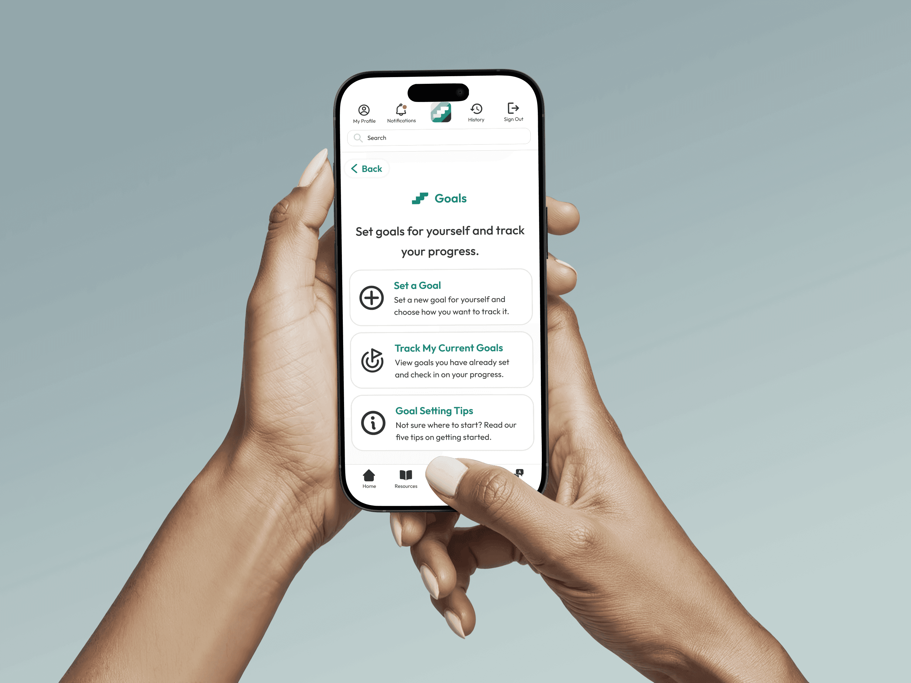
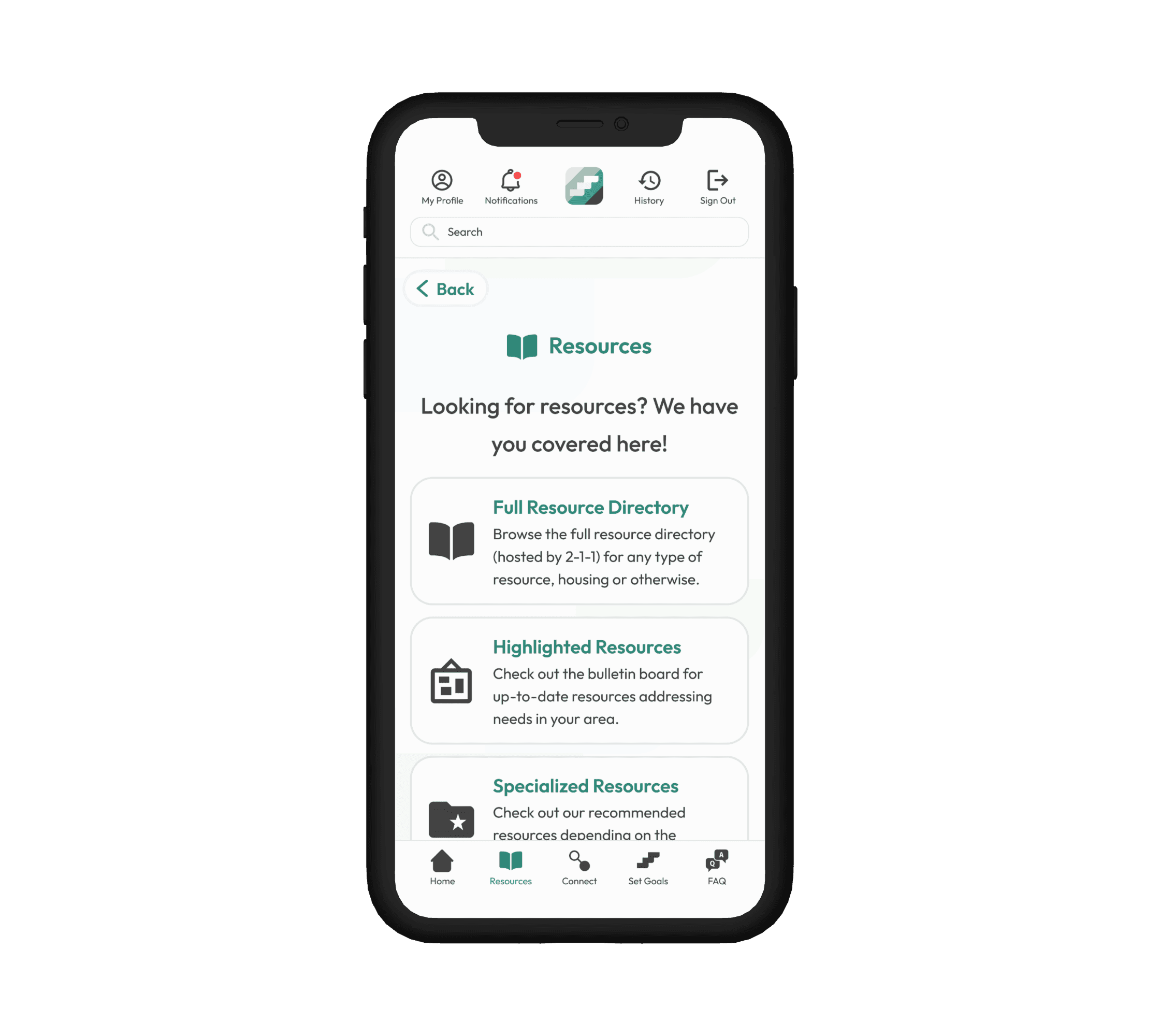
The Resources section is built across three distinct layers, each serving a different level of urgency and specificity.
The Full Resource Directory connects the users directly to several resource directories such as Michigan 2-1-1, giving users access to the broadest possible range of housing and non-housing resources without the app needing to maintain that database independently.
Highlighted Resources surfaces verified, time-sensitive listings relevant to the local area, addressing the trust problem surfaced in the interviews directly.
Specialized Resources narrows further, surfacing recommendations based on specific circumstances and community groups. The three-layer structure means a user can move from broad to specific without ever leaving the app.
The Connect hub brings the three highest-stakes features of the app into a single hub.
Shelter Check-In allows users to view live shelter availability in their area and reserve a bed directly inside the app, removing the need to call ahead or show up without knowing whether space exists.
Case Manager Connect allows a user to request their own case manager who can answer questions and guide them toward the right resources, replacing the phone tree that the interviews identified as the primary barrier to access.
Street Outreach Connect allows users to request that a street outreach team bring resources directly to their location, shifting outreach from something that happens to people to something people can initiate themselves.

Visual 03 — New Client Requests (Case Manager)
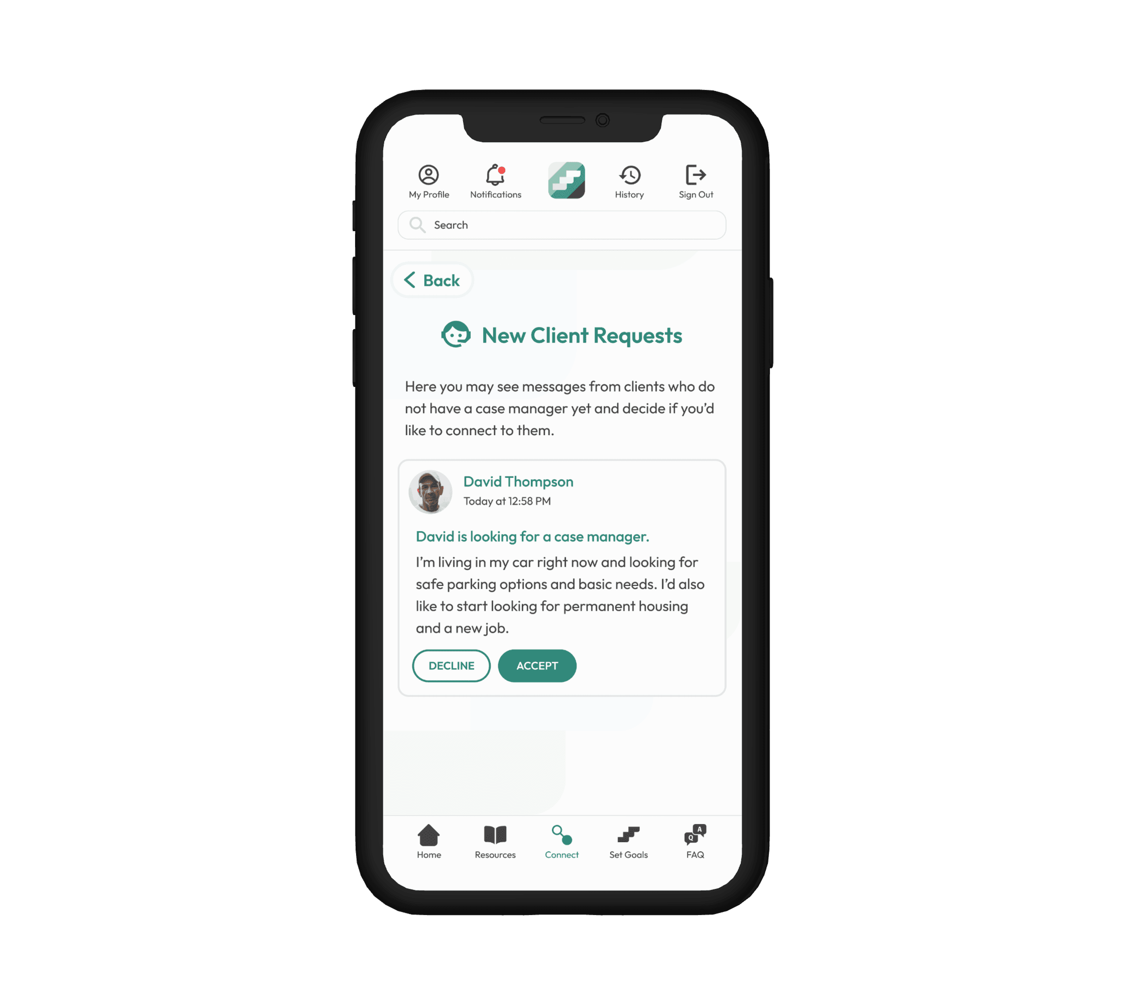
New Client Requests is the service provider side of Case Manager Connect.
When a user like David submits a case manager request, it appears here for available case managers to review. The request shows the user's name, the time it was submitted, and a brief description of their situation and needs in their own words.
The case manager can accept or decline directly from this screen.
The accept/decline model was a deliberate design decision: it gives case managers visibility into incoming requests without overwhelming their capacity, and it ensures that every connection made through the app is an informed and willing one on both sides.
07 Usability Testing
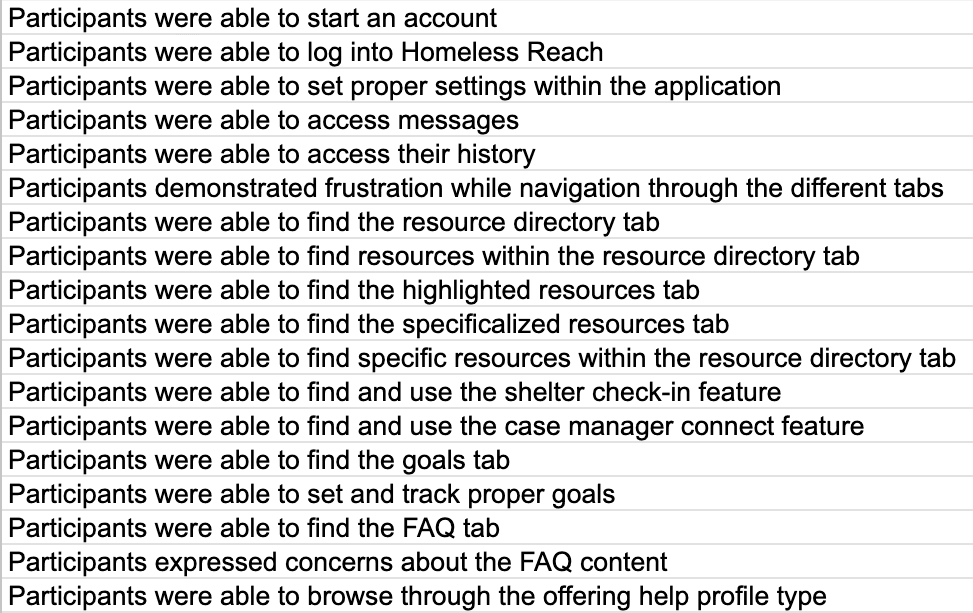
An initial phase of usability testing was conducted via a coding sheet with participants who had direct professional experience inside the homeless service delivery system in Michigan.
08 Lessons Learned
Homeless Reach was the most structurally demanding project I have worked on. Designing for two users with opposing needs, inside a platform serving people in some of the most difficult circumstances imaginable, made every decision feel consequential in a way that most UX work does not.
Architecture before aesthetics. When a product serves two users with opposing needs, the structural decisions made before opening a design tool determine whether both experiences succeed or both get compromised. The seeking and offering split in this project had to be resolved at the navigation level first.
A design system is only as valuable as how early you build it. Defining the component library, color palette, and accessibility standards upfront felt like overhead at the time. It paid back every hour invested the moment the product needed to scale across multiple screens and two completely different user experiences without losing coherence.
Designing for crisis changes your standards. Every friction point in this product had a human cost attached to it which shifted how I thought about simplicity as a functional requirement for someone who may have limited battery, limited data, and no margin for confusion.
The people missing from your research shape your blind spots. I knew throughout this project that the people it was designed for were not in the room. That awareness made me more rigorous about what I claimed to know.