Overview
Parent-child communication breaks down during the tween and teen years, and most families navigate that gap without the right tools to support them. Growth Guidance is a parent-child communication and developmental support iOS application built to change that, giving families a shared platform designed around clarity, trust, and emotional awareness at every stage of the process.
ROLE
Product Designer
Led user research, content design, UI design, and prototyping.
TOOLS
Figma · Miro · Zoom · TEAMS
TIMELINE
Sep'23 – Dec '23 (4 months)
Collaborators
Sneha Bang
01 Design Challenge
Navigating the teenage years is one of the most challenging stretches of parenthood, and most parents are handed no tools to do it well. The emotional and physical changes that come with puberty are difficult to talk about, easy to get wrong, and rarely discussed openly between parent and child until something has already broken down.
What if an app could give parents a way into these conversations before avoidance hardens into distance?
Growth Guidance reframes puberty as a shared family experience rather than a private one each member weathers alone. By giving parents accurate, age-appropriate guidance, a way to track their child's emotional and physical development, and a safe space for the child to express themselves, the app creates the opportunity to foster healthier relationships, promote emotional well-being, and empower both parents and adolescents to understand and manage the changes that come with growing up. The target users are parents of all ages and children ages 8 to 15.
02 Research
Research began by mapping the existing landscape. The goal was to understand what tools parents already reach for, where those tools fall short, and whether the gap they leave was large enough to be worth designing into.
01 — Competitive Analysis
Four applications were analyzed against five criteria central to the problem: parent-child interaction features, child developmental support, strengthening mental health, building communication with parents, and interactive features. Parent Cue and Parenting Hero covered interaction and developmental support but offered little on the child's side of the relationship. Calm Harm focused on mental health and self-regulation but was built for the individual, not the family unit. Messenger Kids enabled communication but carried none of the developmental or emotional support a parent navigating puberty actually needs.
No single product brought communication, developmental tracking, emotional support, and interactivity together in one place. That intersection, the space where a parent and child could meet around the changes of puberty rather than face them separately, was the gap Growth Guidance was designed to fill.

03 Personas, Storyboard & Journey
Two personas were developed to represent the two sides of the relationship Growth Guidance had to serve: the parent seeking a way in, and the child living through the change. A storyboard and a journey map traced the emotional arc each of them moves through, and grounded every design decision in a real moment of need.
Persona 01 — Donna
Donna is a 39-year-old widowed mother of two teenagers and an aeronautics engineer in Jersey City. She captures the primary parent user: deeply motivated to support her children through puberty, but unsure how to start the conversation, especially with her son about the physical changes of the male body. Her goals are to help her kids through this phase without any hiccups and to provide as much support as possible. Her frustration is not a lack of love, it is a lack of a starting point. Donna's card establishes the human stakes behind the parent-facing flows: confident, capable, and still overwhelmed by the one conversation she most wants to get right.

Persona 02 — Sally
Sally is a motivated and intelligent twelve-year-old seventh grader at the start of adolescence. She represents the child user: evolving physically and emotionally, excited and confused in equal measure, and moving through noticeable changes that have left her self-conscious and exploring her own sense of identity. Her goal is to build a strong, open relationship with her parents as she transitions through puberty. Her need is a safe, non-judgmental environment where she can ask questions and receive guidance without feeling embarrassed or overwhelmed. Sally's card makes clear that the app could not be built only for the parent, it had to earn the trust of the child as well.

Storyboard 01— Jack
The storyboard follows Jack, a father overwhelmed by online articles on the emotional changes his tween daughter Emily faces after puberty, and uncertain how to help her. He stumbles upon Growth Guidance, an app promising parental guidance through post-puberty topics, and his curiosity is piqued. He scrolls through the app's topics hoping to find guidance on emotional changes, delves into the resources eager to learn, and dedicates hours to absorbing information through articles and videos. The arc closes on Jack having dinner with Emily, now mindful of their future interactions. The storyboard turned an abstract problem into a single, recognizable journey: from overwhelmed and alone to equipped and present.

Journey Map 01 — Donna
Donna's journey map traces her path across five stages, from looking for an application to better prepare for her kids' puberty, through browsing and selecting topics, assessing the available options, and finally looking into support sessions in her community. For each stage it documents her actions, her behavior, her feelings, and the opportunities the app has to help. The map shows her emotional state dip from excited and curious at the start to confused and overwhelmed in the middle, when she does not know how to express her concerns and worries, before recovering to confident and excited by the end. That dip in the middle, the moment of "I feel so confused and alone," is exactly where the app has the most critical role to play.

04 Branding
The Growth Guidance identity was built to feel calm, trustworthy, and welcoming. For an app that asks families to open up about something they usually avoid, the brand had to signal safety and approachability before a single conversation began.
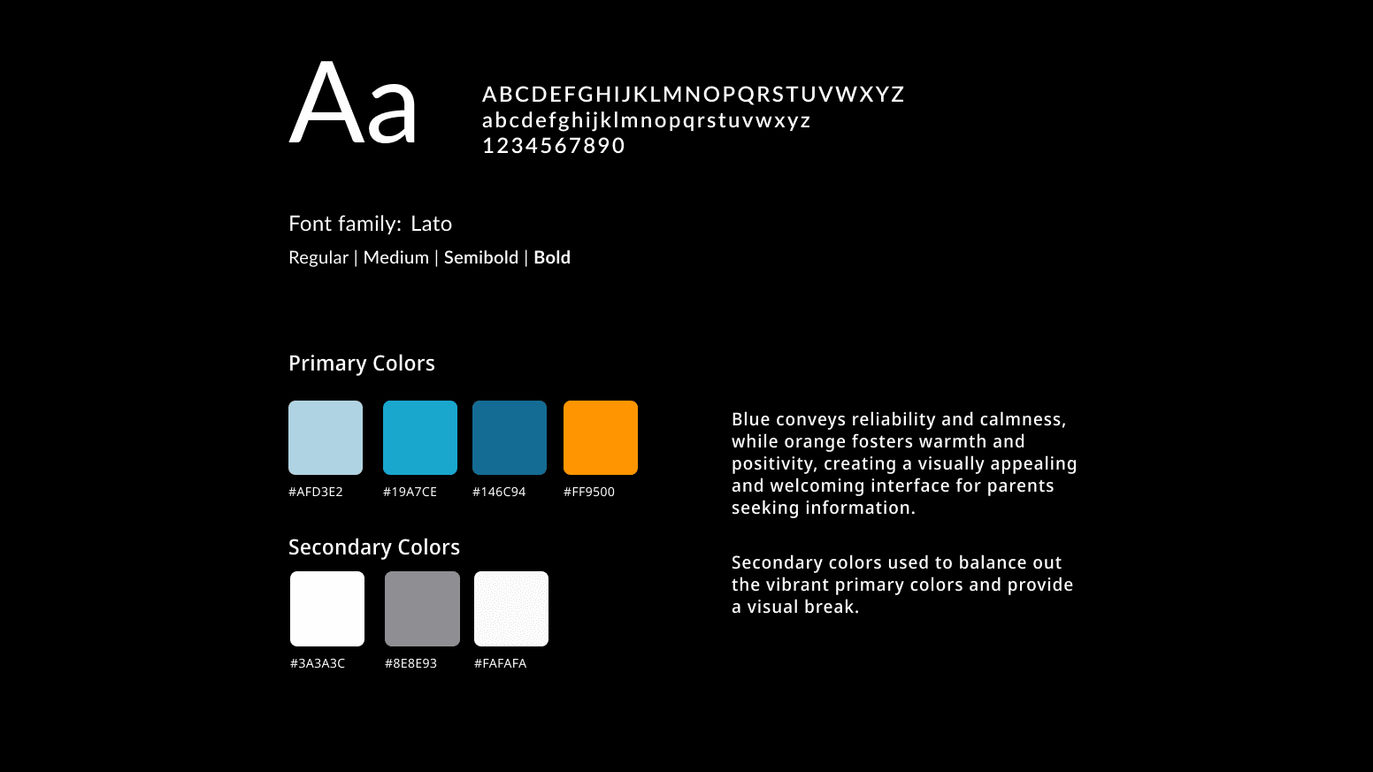
Color
The color palette does the strong emotional lift to ensure that the users feel supported. The blue anchors the system for its associations with trust and stability; orange offsets it so the interface reads warm rather than clinical. Rather than one accent, the blues span a range, lighter tones recede while saturated blues mark primary actions and structure. Muted greys and a near-white give the eye places to rest and keep the vibrant primaries from overwhelming the screen.
Typography
Lato is the typeface across the entire interface, used in Regular, Medium, Semibold, and Bold weights. It was chosen for its clean and modern appearance, enhancing readability while maintaining a friendly and accessible tone. A single typeface applied consistently across every screen keeps cognitive load low and the experience coherent, from onboarding through to the growth timeline.
05 Wireframes
Wireframing started on paper, sketching the core flows before anything was opened in Figma. The goal was to settle the structure of the app, the homepage timeline, the resources hub, the feed, and the onboarding questions.
01 — Homepage, Timeline & Feed
The first set of sketches established the spine of the app. The homepage opens on a personalized greeting and a winding growth timeline the parent moves through. The Timeline screen lets the user select a date and track height, weight, and emotional state, with milestones surfaced along the way. The Feed gives the family a space to write questions or thoughts, post anonymously if they prefer, and browse trending topics from other users. These three screens fixed the daily rhythm of the app before any visual styling existed.

02 — Resources & Profile
The second set sketched the Resources hub and the Profile.
Resources opens with search and trending topic filters, surfaces articles and videos, and lets users bookmark and save what helps. Each resource can carry a professionally-certified rating to signal credibility.
The Profile gathers everything personal in one place: the parent's details, the child's profile, saved articles and videos, bookmarks, the feed, questions posted, and answers given. These screens defined how a user finds trustworthy information and returns to it later.

03 — Emotional Wheel & Onboarding
The third set explored the heart of the concept: an emotional wheel that maps a child's state across feelings like frustration, excitement, aggression, and worry, with articles and videos surfaced to help reduce the "red phase." Alongside it, the onboarding questions were sketched out, asking how old the child is, having the parent rank how they would describe their child's behavior, and capturing the child's approximate weight and height. This is where tracking started being a way to understand and respond to a child's emotional development.

06 Hi-Fi Prototype
After a round of successful wireframe testing, the design moved into a high-fidelity prototype where Growth Guidance came to life within Figma.
User flow 1 — Onboarding
The Growth Guidance onboarding process frames the experience as support rather than data collection, so by the time account creation begins the parent understands what they are committing to.
Once the parent profile is set up, the parent reflects on their child's physical development and, more importantly, their current emotional state and sources of stress. These questions feed directly into the rest of the product, shaping the timeline and the resources the app later recommends. Given the sensitive nature of the information, the questions were written to feel supportive rather than clinical.

User flow 2 — Home Screen/Growth Profile
The Growth timeline is the parent's entry point. Each node marks a logged moment in the child's development over time, letting a parent move back through the record rather than relying on memory. Selecting a date opens that day's tracked height, weight, and emotional state.
From those inputs, the app surfaces recommended resources tuned to the child's current stage. Articles and videos are targeted at easing a difficult emotional phase rather than offering generic advice.

User flow 3 — Feed
The feed gives parents a place to learn from people facing the same questions they are. Other parents and certified professionals share their experiences and advice, and each post is open to comments, so a thread can move from one parent's worry to another's answer without leaving the app.
Posts can be shared under a name or anonymously, which lowers the barrier to asking the questions parents are most embarrassed to voice. And contributions from certified professionals are marked as such, so a parent can weigh casual encouragement against credentialed guidance and know which is which. Together they let the feed feel both safe enough to open up in and trustworthy enough to act on.

User flow 4 — Resources
The Resources hub is where a parent accesses resources that cater to the child's development issue at hand. Articles and videos are organized by topic, with search and trending filters that let a parent narrow straight to what they need, whether that is anxiety, body changes, or any of the specific concerns puberty raises.
Anything useful can be bookmarked and returned to later, since a parent rarely has time to absorb everything the moment they find it, and a saved item is one less thing lost to a busy day. Resources can also be shared with other people directly, passing a helpful article to a partner, another parent, or back into the community feed.

07 Hi-Fi Iterations
With the wireframes validated, the design moved into a high-fidelity prototype and applied the Growth Guidance identity across every screen. Testing then drove a round of targeted iterations, each one resolving a specific moment of user confusion surfaced in feedback.
Iteration 01 — Clarifying the Timeline

Iteration 02 — Resolving Feed Confusion
Users were confusing the feed shown inside the Profile with the feed reachable from the bottom navigation bar. To alleviate that overlap, the Profile's feed entry was renamed "Your Activity," separating a user's own posts and answers from the shared community feed and improving overall understanding of where each lived.

Iteration 03 — Smoothing Onboarding & Sign-Up
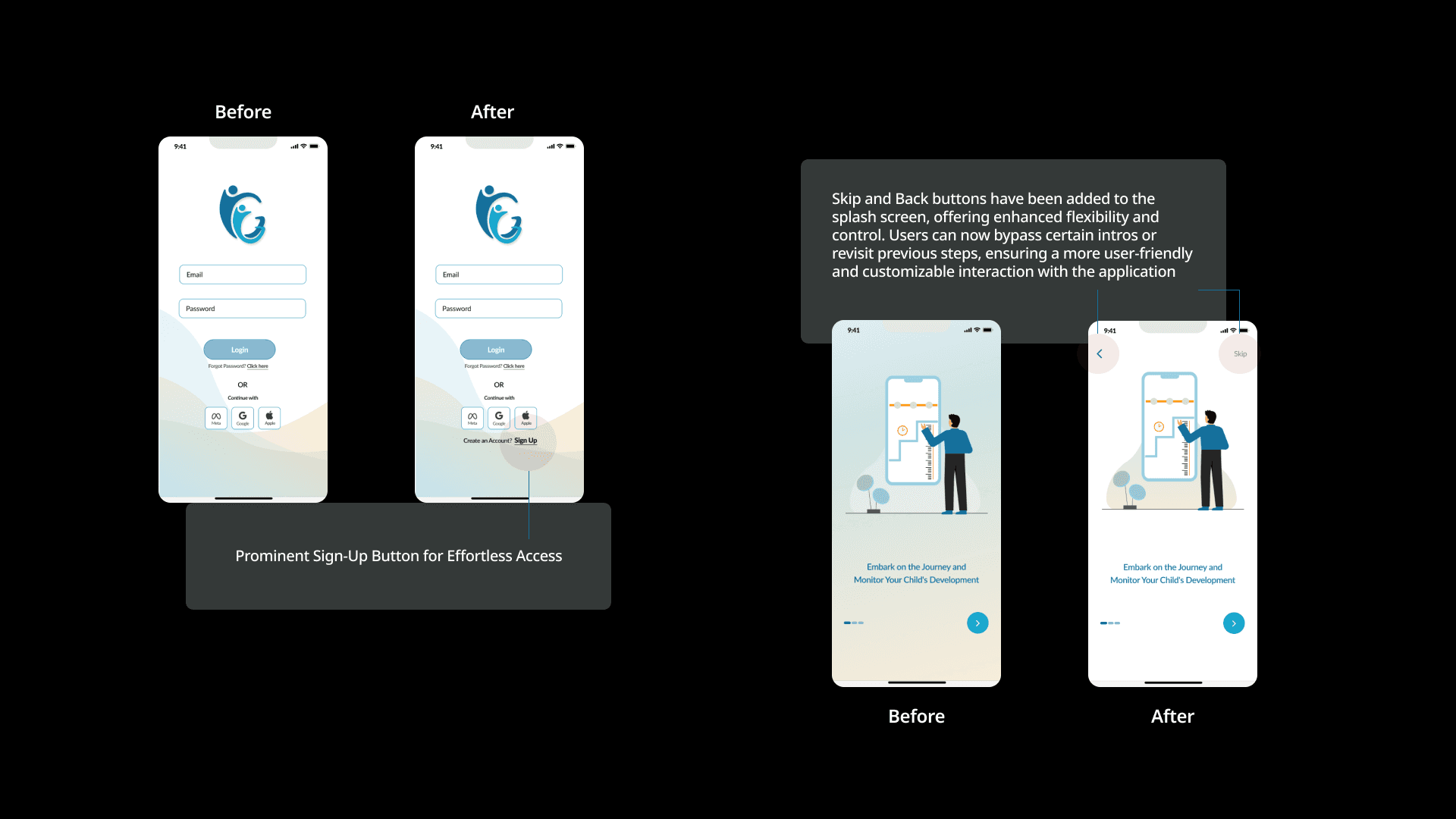
Two changes lowered the barrier to entry. Skip and Back buttons were added to the splash screen, offering enhanced flexibility and control so users can bypass intros or revisit previous steps for a more customizable first experience. On the login screen, a prominent Sign-Up button was added for effortless access, making account creation an obvious next step rather than a hidden one.
08 Lessons Learned
Growth Guidance taught me that designing for a relationship is harder than designing for a single user, and that the emotional context of a product is not separate from its function. It is the function.
A user-centered design process was key to ensuring the content stayed relevant and addressed the emotional needs of parents looking for guidance.
The emotional wheel and the red and green timeline stages started as visual ideas and became the most important part of the product, because they gave a parent a way to see something a child often cannot say out loud. Treating feelings as data the app could surface and act on was the decision that gave Growth Guidance its reason to exist.
Small wording changes carried real weight in this project. Rewriting a greeting sounded trivial, but in testing it was the difference between a confused user and a confident one. The wording in this app was doing the quiet work of keeping anxious parents from bailing, and it mattered as much as anything we designed visually.
Iteration was key here, especially as non-parent designers. The team leaned heavily on communication and testing with users, building the product around their feedback rather than our assumptions. Watching where users hesitated and removing that friction, one screen at a time, is what turned a reasonable first prototype into something a family could actually use.