
Overview
Overview
Overview
Ford's SYNC 4A infotainment system puts drivers in a difficult position: eyes off the road, fingers hunting through nested menus, attention fractured between the drive and the display. This is a case study in how I diagnosed that problem and rebuilt the experience from the ground up - stripping away cognitive load and replacing it with clarity, trust, and driver agency.
Ford's SYNC 4A infotainment system puts drivers in a difficult position: eyes off the road, fingers hunting through nested menus, attention fractured between the drive and the display. This is a case study in how I diagnosed that problem and rebuilt the experience from the ground up - stripping away cognitive load and replacing it with clarity, trust, and driver agency.
Ford's SYNC 4A infotainment system puts drivers in a difficult position: eyes off the road, fingers hunting through nested menus, attention fractured between the drive and the display. This is a case study in how I diagnosed that problem and rebuilt the experience from the ground up - stripping away cognitive load and replacing it with clarity, trust, and driver agency.
ROLE
ROLE
ROLE
UX/UI Designer
Led product direction, user research, content design, UI refinement, and prototyping.
UX/UI Designer
Led product direction, user research, content design, UI refinement, and prototyping.
UX/UI Designer
Led product direction, user research, content design, UI refinement, and prototyping.
TOOLS
TOOLS
TOOLS
Figma · ProtoPie · Miro · Qualtrics
Figma · ProtoPie · Miro · Qualtrics
Figma · ProtoPie · Miro · Qualtrics
TIMELINE
TIMELINE
TIMELINE
Jan '25 – Jun '25 (6 months)
Jan '25 – Jun '25 (6 months)
Jan '25 – Jun '25 (6 months)
Collaborators
Collaborators
Collaborators
N/A – Solo Project
N/A – Solo Project
N/A – Solo Project
01 Design Challenge
01 Design Challenge
For everyday drivers, the modern vehicle cabin has quietly become a second screen - infotainment systems expanding decade over decade, absorbing navigation, media, communication, and diagnostics into interfaces of compounding technical complexity.
For everyday drivers, the modern vehicle cabin has quietly become a second screen - infotainment systems expanding decade over decade, absorbing navigation, media, communication, and diagnostics into interfaces of compounding technical complexity.
What if an infotainment system could be redesigned from the driver's mental model outward; Treating cognitive load as a safety variable, not a design afterthought?
What if an infotainment system could be redesigned from the driver's mental model outward; Treating cognitive load as a safety variable, not a design afterthought?
Ford SYNC 4A Redesigned replaces the layered menu hierarchies and fractured interaction patterns of the original system with a calm, driver-first architecture. By stripping interface complexity down to its structural cause, surfacing safety-critical functions at the top level, and rebuilding around familiar conventions, the redesign restores the one thing no interface should take from a driver in motion: their attention.
Ford SYNC 4A Redesigned replaces the layered menu hierarchies and fractured interaction patterns of the original system with a calm, driver-first architecture. By stripping interface complexity down to its structural cause, surfacing safety-critical functions at the top level, and rebuilding around familiar conventions, the redesign restores the one thing no interface should take from a driver in motion: their attention.


02 Research
02 Research
02 Research
Through user interviews and analysis, I discovered a critical gap: Drivers prioritize convenience, but hidden factors like interface complexity and cognitive overload create unsafe driving situations
The data I analyzed from interviews & research produced three pain points
The data I analyzed from interviews & research produced three pain points
The data I analyzed from interviews & research produced three pain points
1) 68.8% of surveyed SYNC4A users reported dissatisfaction, with the leading complaint being excessive cognitive workload; Drivers are mentally overloaded by the interface at the exact moments they need full attention on the road.
1) 68.8% of surveyed SYNC4A users reported dissatisfaction, with the leading complaint being excessive cognitive workload; Drivers are mentally overloaded by the interface at the exact moments they need full attention on the road.
1) 68.8% of surveyed SYNC4A users reported dissatisfaction, with the leading complaint being excessive cognitive workload; Drivers are mentally overloaded by the interface at the exact moments they need full attention on the road.
2) 50% of participants reported tangible issues with driver assistance features, with the majority citing deep, multi-step menu navigation as the root cause.
2) 50% of participants reported tangible issues with driver assistance features, with the majority citing deep, multi-step menu navigation as the root cause.
2) 50% of participants reported tangible issues with driver assistance features, with the majority citing deep, multi-step menu navigation as the root cause.
3) Only 25% of respondents rated active safety features like Lane-Keeping Assistance as "Extremely Useful" compared to 68.8% for the more passive in-app features
3) Only 25% of respondents rated active safety features like Lane-Keeping Assistance as "Extremely Useful" compared to 68.8% for the more passive in-app features
3) Only 25% of respondents rated active safety features like Lane-Keeping Assistance as "Extremely Useful" compared to 68.8% for the more passive in-app features
01 Design Challenge
For everyday drivers, the modern vehicle cabin has quietly become a second screen - infotainment systems expanding decade over decade, absorbing navigation, media, communication, and diagnostics into interfaces of compounding technical complexity.
What if an infotainment system could be redesigned from the driver's mental model outward; Treating cognitive load as a safety variable, not a design afterthought?
Ford SYNC 4A Redesigned replaces the layered menu hierarchies and fractured interaction patterns of the original system with a calm, driver-first architecture. By stripping interface complexity down to its structural cause, surfacing safety-critical functions at the top level, and rebuilding around familiar conventions, the redesign restores the one thing no interface should take from a driver in motion: their attention.
03 Defining Users & Key User flows
03 Defining Users & Key User flows
03 Defining Users & Key User flows
The survey data established the scale of the problem. The interviews put faces and contexts to it. Three personas emerged, each representing a distinct mode of interaction with SYNC 4A and a distinct set of stakes in getting the redesign right.
Persona 01 — Celine Marsh
Celine Marsh, the Efficiency-Seeking Driver, sits at the sharpest intersection of safety and usability. Her daily hour-long commute means every unnecessary tap, every frozen screen, and every unreliable voice command is a hazard.
Persona 01 — Celine Marsh
Celine Marsh, the Efficiency-Seeking Driver, sits at the sharpest intersection of safety and usability. Her daily hour-long commute means every unnecessary tap, every frozen screen, and every unreliable voice command is a hazard.
Persona 02 — Jack Mancini
Jack Mancini, the Practical No-Nonsense Driver, represented the majority. He does not want innovation, he wants reliability. His frustrations are not with complexity but with inconsistency, exposing a system that fails users before they even begin to drive.
Persona 02 — Jack Mancini
Jack Mancini, the Practical No-Nonsense Driver, represented the majority. He does not want innovation, he wants reliability. His frustrations are not with complexity but with inconsistency, exposing a system that fails users before they even begin to drive.

Persona 03 — John Davis
John Davis, the Performance-Focused Driver, represents the ceiling of the current system. A satisfied user who still identifies friction. His experience reveals that even when SYNC4A works, it works despite its design, not because of it.
Persona 03 — John Davis
John Davis, the Performance-Focused Driver, represents the ceiling of the current system. A satisfied user who still identifies friction. His experience reveals that even when SYNC4A works, it works despite its design, not because of it.

Two critical user flows were mapped to understand how drivers navigate SYNC4A under pressure, revealing where the system demands the most from its users at the worst possible moments.
User flow 01 — Phone Call
The Phone Call Flow maps how a driver initiates an outgoing call from System Home. The process requires tapping the phone icon, selecting a navigation method, and locating a contact through either Favorites or Recents. Favorites, the most intuitive and direct path for frequent contacts, is effectively undermined by a broken route within the system. Rather than reaching their contact directly, users are forced to re-path entirely, adding unplanned steps to what should be the simplest interaction in the flow. When a call drops or fails on top of this, the driver must manually retry through a Connection Error state. What should be a single, effortless interaction becomes a multi-step, eyes-on-screen process while driving.
User flow 01 — Phone Call
The Phone Call Flow maps how a driver initiates an outgoing call from System Home. The process requires tapping the phone icon, selecting a navigation method, and locating a contact through either Favorites or Recents. Favorites, the most intuitive and direct path for frequent contacts, is effectively undermined by a broken route within the system. Rather than reaching their contact directly, users are forced to re-path entirely, adding unplanned steps to what should be the simplest interaction in the flow. When a call drops or fails on top of this, the driver must manually retry through a Connection Error state. What should be a single, effortless interaction becomes a multi-step, eyes-on-screen process while driving.

User flow 02 — Emergency Safety
The Emergency Safety Flow traces the path a driver must take to access urgent assistance from System Home which does not currently exist on the SYNC4A. To reach any emergency function, the driver must first tap the apps icon, navigate to the Apps Screen, locate and tap the Safety Tab, and only then choose between Roadside Assistance or 911. Each path then requires either a form input and an urgency confirmation before a call is placed, keeping in consideration immediacy and safety.
User flow 02 — Emergency Safety
The Emergency Safety Flow traces the path a driver must take to access urgent assistance from System Home which does not currently exist on the SYNC4A. To reach any emergency function, the driver must first tap the apps icon, navigate to the Apps Screen, locate and tap the Safety Tab, and only then choose between Roadside Assistance or 911. Each path then requires either a form input and an urgency confirmation before a call is placed, keeping in consideration immediacy and safety.

The survey data established the scale of the problem. The interviews put faces and contexts to it. Three personas emerged, each representing a distinct mode of interaction with SYNC 4A and a distinct set of stakes in getting the redesign right.
Persona 01 — Celine Marsh
Celine Marsh, the Efficiency-Seeking Driver, sits at the sharpest intersection of safety and usability. Her daily hour-long commute means every unnecessary tap, every frozen screen, and every unreliable voice command is a hazard.
Persona 02 — Jack Mancini
Jack Mancini, the Practical No-Nonsense Driver, represented the majority. He does not want innovation, he wants reliability. His frustrations are not with complexity but with inconsistency, exposing a system that fails users before they even begin to drive.
Persona 03 — John Davis
John Davis, the Performance-Focused Driver, represents the ceiling of the current system. A satisfied user who still identifies friction. His experience reveals that even when SYNC4A works, it works despite its design, not because of it.
Two critical user flows were mapped to understand how drivers navigate SYNC4A under pressure, revealing where the system demands the most from its users at the worst possible moments.
User flow 01 — Phone Call
The Phone Call Flow maps how a driver initiates an outgoing call from System Home. The process requires tapping the phone icon, selecting a navigation method, and locating a contact through either Favorites or Recents. Favorites, the most intuitive and direct path for frequent contacts, is effectively undermined by a broken route within the system. Rather than reaching their contact directly, users are forced to re-path entirely, adding unplanned steps to what should be the simplest interaction in the flow. When a call drops or fails on top of this, the driver must manually retry through a Connection Error state. What should be a single, effortless interaction becomes a multi-step, eyes-on-screen process while driving.
User flow 02 — Emergency Safety
The Emergency Safety Flow traces the path a driver must take to access urgent assistance from System Home which does not currently exist on the SYNC4A. To reach any emergency function, the driver must first tap the apps icon, navigate to the Apps Screen, locate and tap the Safety Tab, and only then choose between Roadside Assistance or 911. Each path then requires either a form input and an urgency confirmation before a call is placed, keeping in consideration immediacy and safety.
04 Paper Prototype & Design Decisions
04 Paper Prototype & Design Decisions
04 Paper Prototype & Design Decisions
Three usability tests with new users who had no prior exposure to the project, focused on three specific tasks.
Feature 01 — Favorites Tab in Phone App
Solving: Broken Contact Access (Core Bug)
Feature 01 — Favorites Tab in Phone App
Solving: Broken Contact Access (Core Bug)
Feature 01 — Favorites Tab in Phone App
Solving: Broken Contact Access (Core Bug)
Data: During initial walkthroughs of the stock SYNC 4A system, 100% of participants attempted to call a saved contact from a favorites list and failed. A core system bug prevented "Favorite" contacts from being callable, forcing users to navigate away, search manually, and re-enter context. This broke the most frequent in-car phone interaction entirely.
Strategy: I recreated the actual contacts screen as a paper prototype to test a repaired flow in isolation. The sketch modeled two selectable contacts (Contact #1, Contact #2) with a simplified list view, a persistent bottom status bar, and bottom tab navigation. The goal was to confirm whether a flattened, single-tap call flow resolved the failure without introducing new confusion.
Result: All three test participants successfully completed the call task on the first attempt with no prompting. Positive response to call placement functionality confirmed the repaired flow was intuitive.
Data: During initial walkthroughs of the stock SYNC 4A system, 100% of participants attempted to call a saved contact from a favorites list and failed. A core system bug prevented "Favorite" contacts from being callable, forcing users to navigate away, search manually, and re-enter context. This broke the most frequent in-car phone interaction entirely.
Strategy: I recreated the actual contacts screen as a paper prototype to test a repaired flow in isolation. The sketch modeled two selectable contacts (Contact #1, Contact #2) with a simplified list view, a persistent bottom status bar, and bottom tab navigation. The goal was to confirm whether a flattened, single-tap call flow resolved the failure without introducing new confusion.
Result: All three test participants successfully completed the call task on the first attempt with no prompting. Positive response to call placement functionality confirmed the repaired flow was intuitive.
Data: During initial walkthroughs of the stock SYNC 4A system, 100% of participants attempted to call a saved contact from a favorites list and failed. A core system bug prevented "Favorite" contacts from being callable, forcing users to navigate away, search manually, and re-enter context. This broke the most frequent in-car phone interaction entirely.
Strategy: I recreated the actual contacts screen as a paper prototype to test a repaired flow in isolation. The sketch modeled two selectable contacts (Contact #1, Contact #2) with a simplified list view, a persistent bottom status bar, and bottom tab navigation. The goal was to confirm whether a flattened, single-tap call flow resolved the failure without introducing new confusion.
Result: All three test participants successfully completed the call task on the first attempt with no prompting. Positive response to call placement functionality confirmed the repaired flow was intuitive.

Feature 02 — Favorites Section
Solving: Cognitive Overload
Feature 02 — Favorites Section
Solving: Cognitive Overload
Feature 02 — Favorites Section
Solving: Cognitive Overload
Data: Users reported frustration at having to scroll through a uniform Apps grid to find frequently used applications. With no customization layer, every app carried equal visual weight, forcing drivers to search rather than recognize.
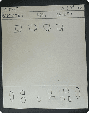
Strategy: I designed a dedicated Favorites section where users' most frequently used applications are surfaced at the top level of the interface, pinned and prioritized. The paper sketch tested a 4-app grid (App #1 through App #4) within a tabbed structure: Favorites, Apps, Safety. This allowed the interface to adapt to individual usage patterns rather than forcing every user through the same generic hierarchy.
Result: Positive response to the Favorites tab and customization approach across all test sessions. Participants immediately understood the logic of the tab separation and expressed interest in controlling which apps appeared there.
Data: Users reported frustration at having to scroll through a uniform Apps grid to find frequently used applications. With no customization layer, every app carried equal visual weight, forcing drivers to search rather than recognize.
Strategy: I designed a dedicated Favorites section where users' most frequently used applications are surfaced at the top level of the interface, pinned and prioritized. The paper sketch tested a 4-app grid (App #1 through App #4) within a tabbed structure: Favorites, Apps, Safety. This allowed the interface to adapt to individual usage patterns rather than forcing every user through the same generic hierarchy.
Result: Positive response to the Favorites tab and customization approach across all test sessions. Participants immediately understood the logic of the tab separation and expressed interest in controlling which apps appeared there.
Data: Users reported frustration at having to scroll through a uniform Apps grid to find frequently used applications. With no customization layer, every app carried equal visual weight, forcing drivers to search rather than recognize.
Strategy: I designed a dedicated Favorites section where users' most frequently used applications are surfaced at the top level of the interface, pinned and prioritized. The paper sketch tested a 4-app grid (App #1 through App #4) within a tabbed structure: Favorites, Apps, Safety. This allowed the interface to adapt to individual usage patterns rather than forcing every user through the same generic hierarchy.
Result: Positive response to the Favorites tab and customization approach across all test sessions. Participants immediately understood the logic of the tab separation and expressed interest in controlling which apps appeared there.
Feature 03 — Safety Tab (911 Assist & Roadside Assistance)
Solving: The Missing (No Infrastructure for Driver Safety Emergencies)
Feature 03 — Safety Tab (911 Assist & Roadside Assistance)
Solving: The Missing (No Infrastructure for Driver Safety Emergencies)
Feature 03 — Safety Tab (911 Assist & Roadside Assistance)
Solving: The Missing (No Infrastructure for Driver Safety Emergencies)
Data: The stock SYNC 4A system has no dedicated pathway for driver safety situations. Emergency-adjacent functions are buried inside the same Apps menu as entertainment and connectivity, with no distinction between a flat tire and a life-threatening crisis.
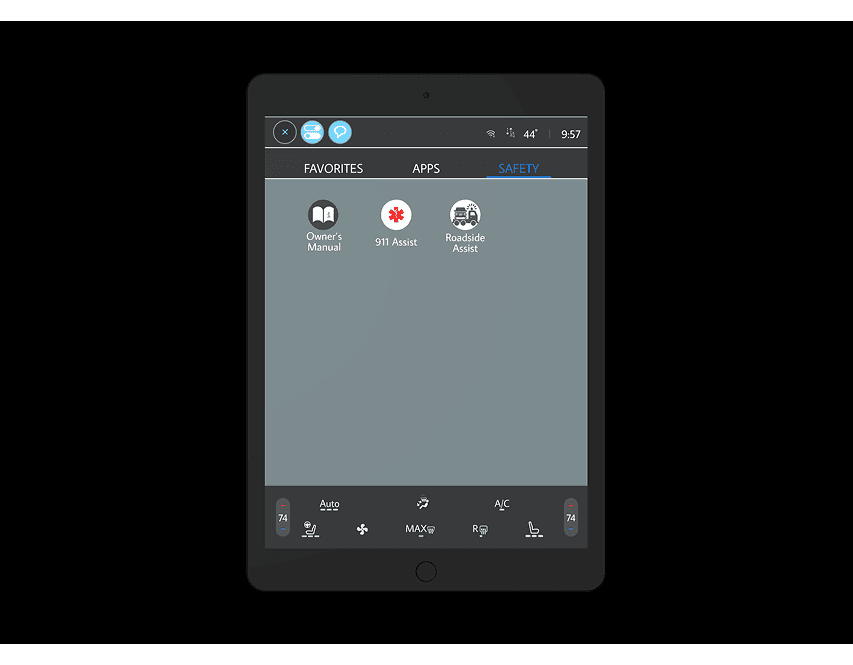
Strategy: I replaced the "Entertainment" tab entirely with a dedicated Safety tab, permanently anchored in primary navigation. The Safety tab includes two key features, 911 Assist which is designed for life-threatening situations requiring minimal agency and Roadside Assistance which is for mid-tier situation such as breakdowns, flat tires, fuel situations where the driver has time but still needs structured help.
Result: Participants understood the distinction between the two features once they explored the tab, but their first reaction was curiosity rather than clarity. This informed how the full interaction models were developed in Prototype II.
Data: The stock SYNC 4A system has no dedicated pathway for driver safety situations. Emergency-adjacent functions are buried inside the same Apps menu as entertainment and connectivity, with no distinction between a flat tire and a life-threatening crisis.
Strategy: I replaced the "Entertainment" tab entirely with a dedicated Safety tab, permanently anchored in primary navigation. The Safety tab includes two key features, 911 Assist which is designed for life-threatening situations requiring minimal agency and Roadside Assistance which is for mid-tier situation such as breakdowns, flat tires, fuel situations where the driver has time but still needs structured help.
Result: Participants understood the distinction between the two features once they explored the tab, but their first reaction was curiosity rather than clarity. This informed how the full interaction models were developed in Prototype II.
Data: The stock SYNC 4A system has no dedicated pathway for driver safety situations. Emergency-adjacent functions are buried inside the same Apps menu as entertainment and connectivity, with no distinction between a flat tire and a life-threatening crisis.
Strategy: I replaced the "Entertainment" tab entirely with a dedicated Safety tab, permanently anchored in primary navigation. The Safety tab includes two key features, 911 Assist which is designed for life-threatening situations requiring minimal agency and Roadside Assistance which is for mid-tier situation such as breakdowns, flat tires, fuel situations where the driver has time but still needs structured help.
Result: Participants understood the distinction between the two features once they explored the tab, but their first reaction was curiosity rather than clarity. This informed how the full interaction models were developed in Prototype II.

05 Hi-Fi Prototype I & Testing
05 Hi-Fi Prototype I & Testing
05 Hi-Fi Prototype I & Testing
Where the paper prototype validated architecture, the first high-fidelity prototype tested whether that architecture survived contact with a real interface. Three usability sessions were conducted using think-aloud protocol.
Feature 01 — Streamlined Calling
Solving: Broken Contact Access
Feature 01 — Streamlined Calling
Solving: Broken Contact Access
Feature 01 — Streamlined Calling
Solving: Broken Contact Access
Data: The paper prototype confirmed the flat call flow worked in sketch form. Moving to high fidelity introduced a new friction point: the persistent bottom quick-launch bar housing Apple CarPlay, Radio, Owner's Manual, and Roadside Assist simultaneously created visual competition with the primary contact list above it.
Strategy: The Favorites tab was built with real contact names, avatars, and tap targets modeled on iOS-familiar interaction patterns. The bottom bar was retained but refined to reduce visual weight, separating it more clearly from the primary content area above.
Result: All participants located and called their first favorite contact without prompting. The iOS-familiar tab pattern required no instruction. Positive feedback confirmed the repaired flow from paper held in high fidelity.
Data: The paper prototype confirmed the flat call flow worked in sketch form. Moving to high fidelity introduced a new friction point: the persistent bottom quick-launch bar housing Apple CarPlay, Radio, Owner's Manual, and Roadside Assist simultaneously created visual competition with the primary contact list above it.
Strategy: The Favorites tab was built with real contact names, avatars, and tap targets modeled on iOS-familiar interaction patterns. The bottom bar was retained but refined to reduce visual weight, separating it more clearly from the primary content area above.
Result: All participants located and called their first favorite contact without prompting. The iOS-familiar tab pattern required no instruction. Positive feedback confirmed the repaired flow from paper held in high fidelity.
Data: The paper prototype confirmed the flat call flow worked in sketch form. Moving to high fidelity introduced a new friction point: the persistent bottom quick-launch bar housing Apple CarPlay, Radio, Owner's Manual, and Roadside Assist simultaneously created visual competition with the primary contact list above it.
Strategy: The Favorites tab was built with real contact names, avatars, and tap targets modeled on iOS-familiar interaction patterns. The bottom bar was retained but refined to reduce visual weight, separating it more clearly from the primary content area above.
Result: All participants located and called their first favorite contact without prompting. The iOS-familiar tab pattern required no instruction. Positive feedback confirmed the repaired flow from paper held in high fidelity.

Feature 02 — Safety Tab (911 Assist & Roadside Assist)
Solving: Semantic Confusion
Feature 02 — Safety Tab (911 Assist & Roadside Assist)
Solving: Semantic Confusion
Feature 02 — Safety Tab (911 Assist & Roadside Assist)
Solving: Semantic Confusion
Data: The stock SYNC 4A offers no dedicated safety pathway. A driver in crisis navigates the same menu as a driver changing a playlist.
Strategy: I introduced a dedicated Safety tab, permanently anchored in primary navigation. Within it, I proposed two original features the stock system does not offer: 911 Assist for life-threatening situations, and Roadside Assist for breakdowns and non-critical emergencies where the driver needs structured help.
Result: Participants understood the distinction between the two features once they explored the tab, but their first reaction was curiosity rather than clarity. This informed how the interaction models were developed in Prototype II.
Data: The stock SYNC 4A offers no dedicated safety pathway. A driver in crisis navigates the same menu as a driver changing a playlist.
Strategy: I introduced a dedicated Safety tab, permanently anchored in primary navigation. Within it, I proposed two original features the stock system does not offer: 911 Assist for life-threatening situations, and Roadside Assist for breakdowns and non-critical emergencies where the driver needs structured help.
Result: Participants understood the distinction between the two features once they explored the tab, but their first reaction was curiosity rather than clarity. This informed how the interaction models were developed in Prototype II.
Data: The stock SYNC 4A offers no dedicated safety pathway. A driver in crisis navigates the same menu as a driver changing a playlist.
Strategy: I introduced a dedicated Safety tab, permanently anchored in primary navigation. Within it, I proposed two original features the stock system does not offer: 911 Assist for life-threatening situations, and Roadside Assist for breakdowns and non-critical emergencies where the driver needs structured help.
Result: Participants understood the distinction between the two features once they explored the tab, but their first reaction was curiosity rather than clarity. This informed how the interaction models were developed in Prototype II.
06 Hi-Fi Prototype II
06 Hi-Fi Prototype II
06 Hi-Fi Prototype II
Building directly on the feedback from the first round of testing, the second prototype expanded on two specific findings: text alignment issues that eroded visual credibility, and unresolved curiosity around what the Safety features would actually do.
Feature 01 — Visual Refinements
Solving: Legibility and Brand Alignment
Data: Participants flagged text alignment issues across multiple screens, eroding the visual polish of an otherwise well-received interface. The background color also read slightly off against Ford's design language, and the HVAC control strip was identified as a source of unnecessary on-screen cognitive load.
Strategy: Text alignment was corrected throughout. Background color was shifted to align more faithfully with Ford's typography system, strengthening the sense that this was a considered extension of an existing product. HVAC controls were simplified to reduce density in the bottom climate strip without removing any functionality.
Result: Visual credibility improved across all participants in the second round. The interface was described as feeling more consistent with the Ford product ecosystem.
Data: Participants flagged text alignment issues across multiple screens, eroding the visual polish of an otherwise well-received interface. The background color also read slightly off against Ford's design language, and the HVAC control strip was identified as a source of unnecessary on-screen cognitive load.
Strategy: Text alignment was corrected throughout. Background color was shifted to align more faithfully with Ford's typography system, strengthening the sense that this was a considered extension of an existing product. HVAC controls were simplified to reduce density in the bottom climate strip without removing any functionality.
Result: Visual credibility improved across all participants in the second round. The interface was described as feeling more consistent with the Ford product ecosystem.
Data: Participants flagged text alignment issues across multiple screens, eroding the visual polish of an otherwise well-received interface. The background color also read slightly off against Ford's design language, and the HVAC control strip was identified as a source of unnecessary on-screen cognitive load.
Strategy: Text alignment was corrected throughout. Background color was shifted to align more faithfully with Ford's typography system, strengthening the sense that this was a considered extension of an existing product. HVAC controls were simplified to reduce density in the bottom climate strip without removing any functionality.
Result: Visual credibility improved across all participants in the second round. The interface was described as feeling more consistent with the Ford product ecosystem.

Feature 02 — Roadside Assist: Full Interaction Model
Solving: High-Stress Input
Feature 02 — Roadside Assist: Full Interaction Model
Solving: High-Stress Input
Data: Requiring a driver to manually enter their location during a breakdown introduces unnecessary cognitive load at exactly the moment their capacity is lowest. The paper prototype confirmed users understood the feature. The hi-fi prototype had to confirm they could actually use it under pressure.
Strategy: Roadside Assist auto-syncs with Maps to pre-fill the vehicle's current location, removing the most demanding step from the flow entirely. The driver selects location type, the assistance needed (Towing, Flat Tire Change, etc.). The entire flow is completable within a stopped vehicle with minimal input.
Result: The structured form was understood immediately. Participants completed the flow without confusion and responded positively to the auto-location feature, describing it as the detail that made the feature feel trustworthy.
Data: Requiring a driver to manually enter their location during a breakdown introduces unnecessary cognitive load at exactly the moment their capacity is lowest. The paper prototype confirmed users understood the feature. The hi-fi prototype had to confirm they could actually use it under pressure.
Strategy: Roadside Assist auto-syncs with Maps to pre-fill the vehicle's current location, removing the most demanding step from the flow entirely. The driver selects location type, the assistance needed (Towing, Flat Tire Change, etc.). The entire flow is completable within a stopped vehicle with minimal input.
Result: The structured form was understood immediately. Participants completed the flow without confusion and responded positively to the auto-location feature, describing it as the detail that made the feature feel trustworthy.
Data: Requiring a driver to manually enter their location during a breakdown introduces unnecessary cognitive load at exactly the moment their capacity is lowest. The paper prototype confirmed users understood the feature. The hi-fi prototype had to confirm they could actually use it under pressure.
Strategy: Roadside Assist auto-syncs with Maps to pre-fill the vehicle's current location, removing the most demanding step from the flow entirely. The driver selects location type, the assistance needed (Towing, Flat Tire Change, etc.). The entire flow is completable within a stopped vehicle with minimal input.
Result: The structured form was understood immediately. Participants completed the flow without confusion and responded positively to the auto-location feature, describing it as the detail that made the feature feel trustworthy.

Feature 03 — 911 Assist: Full Interaction Model
Solving: Agency Collapse in Life-Threatening Situations
Data: A driver in a genuine emergency may not have the cognitive or physical capacity to navigate a complex interface. Every additional step between the driver and emergency services is a design failure.
Strategy: 911 Assist surfaces Type of Emergency and Urgency Level as quick-select options with location tracking pre-enabled. The most considered detail in the feature is Silent Mode. In certain emergencies, an audible confirmation that 911 has been contacted could escalate danger rather than reduce it. Silent Mode allows the call and location transmission to complete without any sound.
Result: The 911 Assist flow was understood as distinct from Roadside Assist. Silent Mode was flagged by participants as a detail they had never encountered in an interface before and immediately understood the purpose of. The feature was described as something that felt genuinely considered for real-world conditions.
Data: A driver in a genuine emergency may not have the cognitive or physical capacity to navigate a complex interface. Every additional step between the driver and emergency services is a design failure.
Strategy: 911 Assist surfaces Type of Emergency and Urgency Level as quick-select options with location tracking pre-enabled. The most considered detail in the feature is Silent Mode. In certain emergencies, an audible confirmation that 911 has been contacted could escalate danger rather than reduce it. Silent Mode allows the call and location transmission to complete without any sound.
Result: The 911 Assist flow was understood as distinct from Roadside Assist. Silent Mode was flagged by participants as a detail they had never encountered in an interface before and immediately understood the purpose of. The feature was described as something that felt genuinely considered for real-world conditions.
Data: A driver in a genuine emergency may not have the cognitive or physical capacity to navigate a complex interface. Every additional step between the driver and emergency services is a design failure.
Strategy: 911 Assist surfaces Type of Emergency and Urgency Level as quick-select options with location tracking pre-enabled. The most considered detail in the feature is Silent Mode. In certain emergencies, an audible confirmation that 911 has been contacted could escalate danger rather than reduce it. Silent Mode allows the call and location transmission to complete without any sound.
Result: The 911 Assist flow was understood as distinct from Roadside Assist. Silent Mode was flagged by participants as a detail they had never encountered in an interface before and immediately understood the purpose of. The feature was described as something that felt genuinely considered for real-world conditions.

07 Lessons Learned
07 Lessons Learned
07 Lessons Learned
Redesigning SYNC 4A reinforced that the most consequential design work happens at the intersection of human behavior, system constraints, and context of use, particularly when that context carries physical risk.
Cognitive load in safety-critical environments is not a UX concern to be balanced against aesthetics. It is the primary design constraint, and every interaction decision must be evaluated against it first. Working on a system used at highway speed made this visceral. I learned that in that context, an extra tap is not an inconvenience. It is a liability.
Introducing features outside an existing product's scope demands more than good ideas. Designing 911 Assist and Roadside Assist forced me to think carefully about the spectrum of human distress and what each point on that spectrum actually requires from an interface. A driver who is panicking cannot be given the same interaction model as a driver who has a flat tire. Conflating the two would have produced a feature that served neither.
Paper prototyping is a strategic choice, not a fidelity one. In this project it was the phase that revealed the Safety tab's labeling problem before it became embedded in a high-fidelity component. That single finding reshaped how both safety features were introduced to users before a single high-fidelity screen was built.
I learned to treat user hesitation as a diagnostic signal rather than a positive one. When participants expressed curiosity about a safety feature before engaging with it, my instinct was to read that as interest. It was not. It was uncertainty, and in a safety context, an uncertain user is an unsafe one.
Designing within Ford's established product ecosystem required a kind of discipline I had not fully practiced before. Every decision had to be justified not just by good design principles but by whether it felt like a natural extension of a system users already trusted. That tension between invention and restraint became the most instructive part of the entire project.
Cognitive load in safety-critical environments is not a UX concern to be balanced against aesthetics. It is the primary design constraint, and every interaction decision must be evaluated against it first. Working on a system used at highway speed made this visceral. I learned that in that context, an extra tap is not an inconvenience. It is a liability.
Introducing features outside an existing product's scope demands more than good ideas. Designing 911 Assist and Roadside Assist forced me to think carefully about the spectrum of human distress and what each point on that spectrum actually requires from an interface. A driver who is panicking cannot be given the same interaction model as a driver who has a flat tire. Conflating the two would have produced a feature that served neither.
Paper prototyping is a strategic choice, not a fidelity one. In this project it was the phase that revealed the Safety tab's labeling problem before it became embedded in a high-fidelity component. That single finding reshaped how both safety features were introduced to users before a single high-fidelity screen was built.
I learned to treat user hesitation as a diagnostic signal rather than a positive one. When participants expressed curiosity about a safety feature before engaging with it, my instinct was to read that as interest. It was not. It was uncertainty, and in a safety context, an uncertain user is an unsafe one.
Designing within Ford's established product ecosystem required a kind of discipline I had not fully practiced before. Every decision had to be justified not just by good design principles but by whether it felt like a natural extension of a system users already trusted. That tension between invention and restraint became the most instructive part of the entire project.
Cognitive load in safety-critical environments is not a UX concern to be balanced against aesthetics. It is the primary design constraint, and every interaction decision must be evaluated against it first. Working on a system used at highway speed made this visceral. I learned that in that context, an extra tap is not an inconvenience. It is a liability.
Introducing features outside an existing product's scope demands more than good ideas. Designing 911 Assist and Roadside Assist forced me to think carefully about the spectrum of human distress and what each point on that spectrum actually requires from an interface. A driver who is panicking cannot be given the same interaction model as a driver who has a flat tire. Conflating the two would have produced a feature that served neither.
Paper prototyping is a strategic choice, not a fidelity one. In this project it was the phase that revealed the Safety tab's labeling problem before it became embedded in a high-fidelity component. That single finding reshaped how both safety features were introduced to users before a single high-fidelity screen was built.
I learned to treat user hesitation as a diagnostic signal rather than a positive one. When participants expressed curiosity about a safety feature before engaging with it, my instinct was to read that as interest. It was not. It was uncertainty, and in a safety context, an uncertain user is an unsafe one.
Designing within Ford's established product ecosystem required a kind of discipline I had not fully practiced before. Every decision had to be justified not just by good design principles but by whether it felt like a natural extension of a system users already trusted. That tension between invention and restraint became the most instructive part of the entire project.
Please note that Ford SYNC is a trademark of Ford Motor Company. This is an independent student redesign concept, not affiliated with or endorsed by Ford.
Please note that Ford SYNC is a trademark of Ford Motor Company. This is an independent student redesign concept, not affiliated with or endorsed by Ford.
Other Projects

Homeless Reach
Providing support and resources for the homeless community through outreach
TEAM PROJECT / END-TO-END UX DESIGN / COMMUNITY
Growth Guidance
Fostering healthy conversations about growth and change within the household
TEAM PROJECT / END-TO-END UX DESIGN / GROWTH

Other Projects
Other Projects
Homeless Reach
Providing support and resources for the homeless community
TEAM PROJECT / END-TO-END UX DESIGN
Growth Guidance
Fostering healthy conversations about growth and change within the household
TEAM PROJECT / END-TO-END UX DESIGN / GROWTH
TEAM PROJECT / END-TO-END UX DESIGN / GROWTH